

The 2024 color landscape is full of stunning shades of versatile blues and earthy tones to connect living spaces and ignite your creativity.
Last year, warm hues that sparked creativity took center stage. We’re seeing more blues and earth tones bringing comfort, versatility, and natural connections to living spaces. From a grounding soft black to an uplifting sky blue, from a muted olive green to a warm peach, the options are endless.
We’ve compiled a short list of our favorite ‘Colors of the Year for 2024’, making it easier for you to keep track and explore the ones that catch your eye. There are more to come so check back for updates soon. Whether you’ve already embraced these colors or are still deciding how to incorporate them into your walls or wardrobe, this handy cheat sheet has got you covered. And as a bonus, we’ve even included some ideas on how to bring these colors into your home to ignite your creative flow. We can’t wait to see how you put these colors to work infusing your spaces with a colorful refresh.
Benjamin Moore: Blue Nova
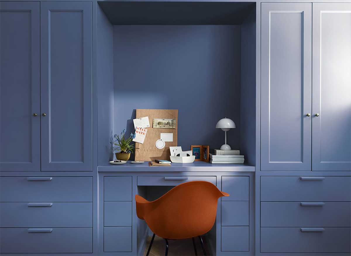
Indulge your senses, explore new horizons, and let Blue Nova guide you on a journey of creativity within your living space. This cosmic blend of blue and violet is more than just a hue; it’s an invitation to embrace adventure and indulge in new experiences. In a unique collaboration, Benjamin Moore and aerospace company Blue Origin have joined forces to unveil this color and ignite a passion for STEM education and careers in the space industry among future generations.
The paint experts at Benjamin Moore suggest creating a captivating atmosphere by pairing this grounding blue with vibrant, contrasting colors such as orange. This combination brings a touch of ethereality to any space. Moreover, think beyond the walls and explore the idea of a statement-making painted ceiling or covering every wall of a powder room with Blue Nova. The choice is yours, and the options are limitless.
Sherwin-Williams: Upward
This serene blue color embodies the feeling of taking a slow breath of crisp air, evokeing a sense of contentment and peace. With this color, they invite consumers to infuse a new sense of ease and possibility into their spaces.
Upward, with its light blue shade and gray undertones, is perfect for creating a coastal chic design style. It can be used as a standout color in a bathroom or kitchen. In a calming bedroom, it also serves as a refreshing accent wall.
Overall, this relaxed blue hue not only adds visual appeal but also creates a tranquil atmosphere. It encourages pause, meditation, and a feeling of tranquility when incorporated into interior design.
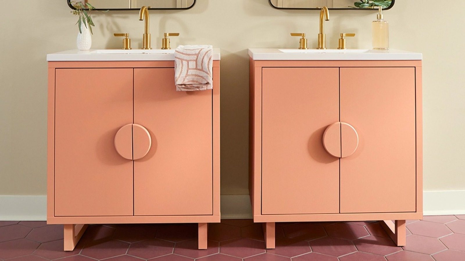
Pantone: Peach Fuzz
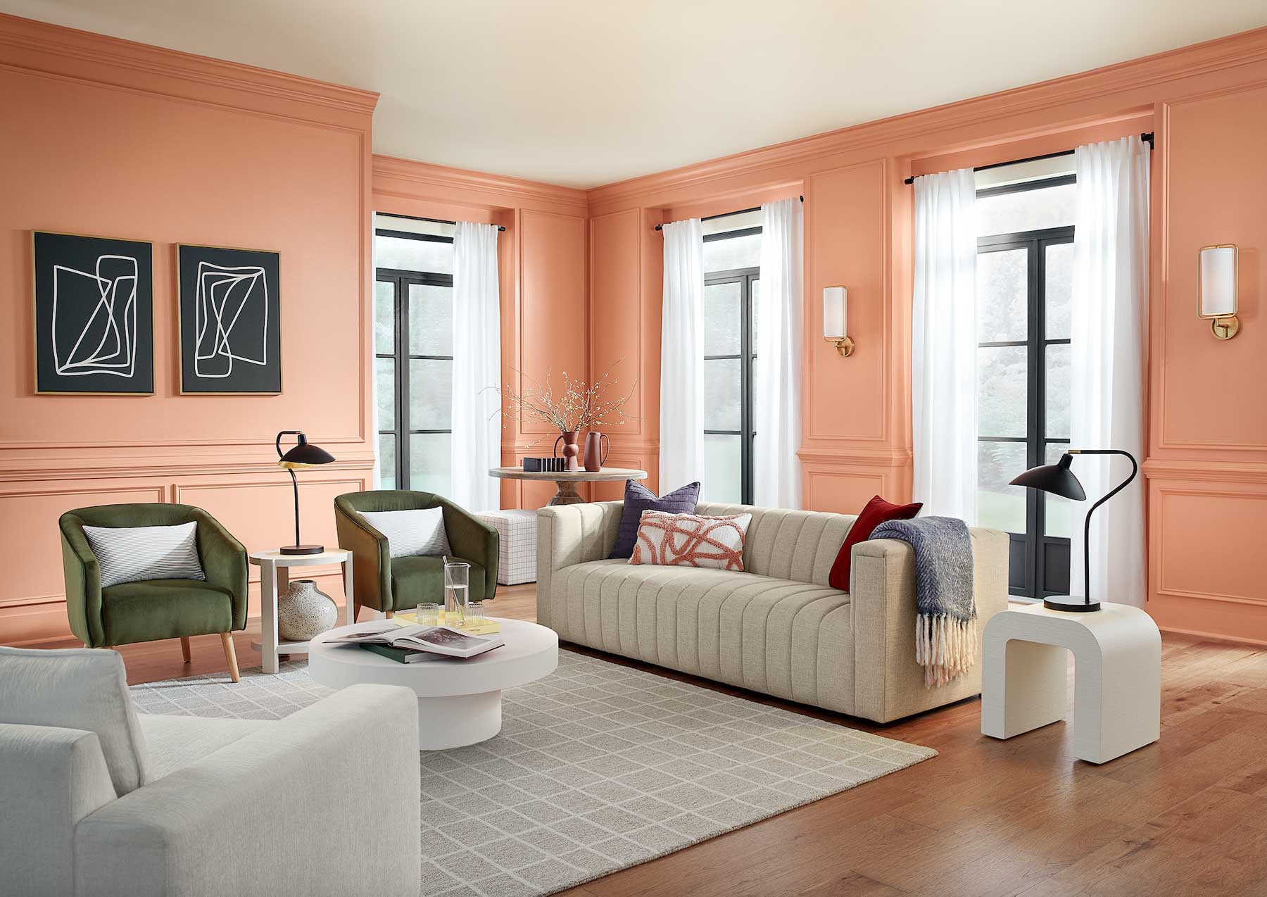
A light, delicate shade that sits between pink and orange, Peach Fuzz marks the 25th anniversary of Pantone’s Color of the Year program. This soft, heartfelt hue expresses the desire to nurture kindness, compassion, and connection—all while fostering a deep coziness as we seek a peaceful future.
PPG/Glidden: Limitless
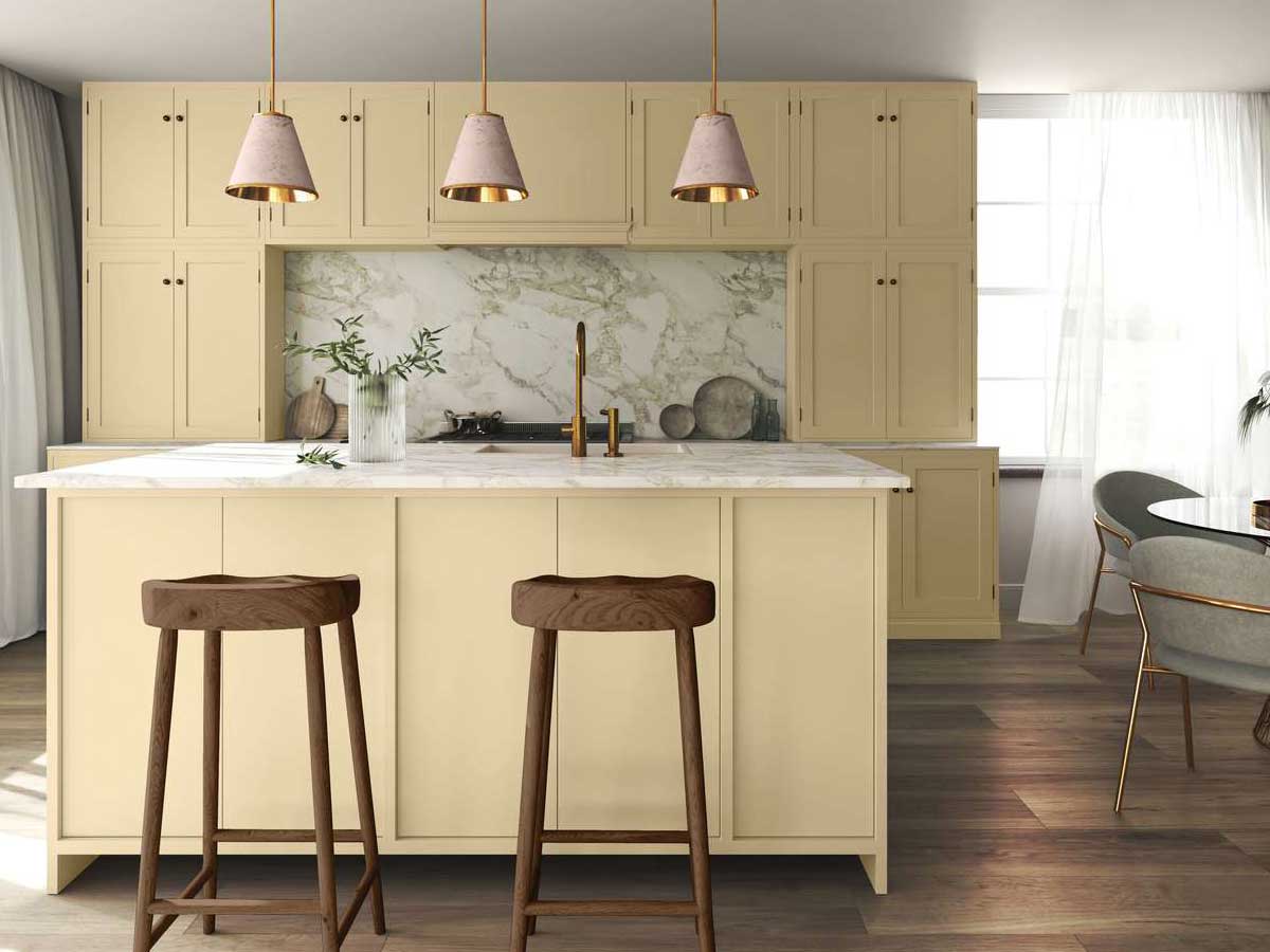
This remarkable hue, described as a honey beige, defies the norms as it possesses the endurance of a primary color while maintaining the adaptability of a neutral shade.
In this ever-evolving world where consumers are pushing the boundaries of color usage in unconventional ways, a versatile palette is in demand. Glidden’s Limitless offers just that. With its warm neutral tone, it can be applied anywhere and everywhere, from adorning kitchen cabinets to painting ceilings, ensuring a perfect fit with any new or existing decor.
So, if you’re looking to inject an extra touch of creativity and vibrancy into your space, Glidden’s Limitless is the perfect choice. Step into this new era of endless possibilities and embrace the beauty and versatility that this remarkable color brings. Don’t limit yourself; let your imagination run wild with Limitless.
Behr: Cracked Pepper
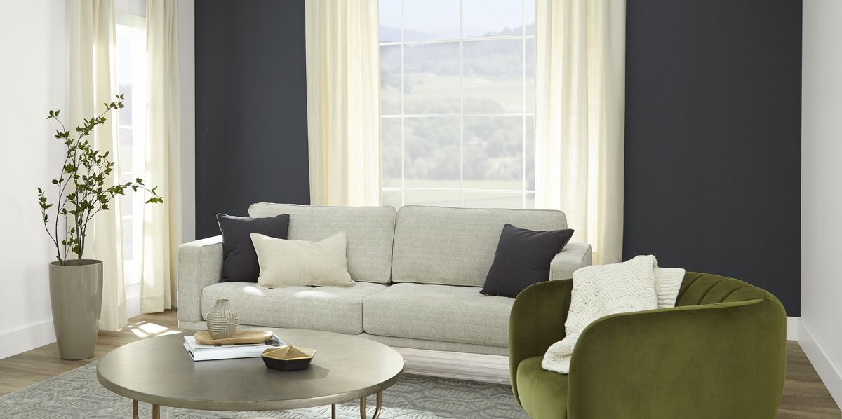 This soft black shade possesses the remarkable ability to ground any space, while also possessing a timeless quality. It effortlessly blends into any design style, making it an approachable gateway into the world of darker paint.
The announcement of Cracked Pepper as the Color of the Year was made by Behr and The Home Depot at Stanly Ranch in Napa, California. The choice of location perfectly showcases how black can effortlessly blend with nature and other neutrals, creating a harmonious and captivating aesthetic.
According to Erika Woelfel, the vice president of color and creative services at Behr Paint, “Cracked Pepper empowers and elevates our senses, creating a truly sophisticated atmosphere in any room of our homes.” Its timeless and modern appeal is sure to leave a lasting impression on all who experience it.
It’s clear that neutral decor just got a whole lot more exciting. Get ready to be inspired and transform your living spaces with this captivating and versatile shade.
Sherwin-Williams: Persimmon
Persimmon exudes warmth, vitality, and a hint of nostalgia. In today’s world, our homes have evolved to become more than just living spaces; they are now sanctuaries of relaxation. The concept of “Renewed Comfort” effectively captures this idea, and this curated collection perfectly blends cherished traditions with contemporary innovation.
The main focus of this collection is the earthy color named for the plump, sweet fruit. Persimmon combines softness, exuberance, and security. The warm and inviting color is ideal for creating a cozy and comfortable atmosphere in any room. It can be used as an accent with other shades in the collection to add a touch of brightness and vitality, or as a more dominant color to create a bold and statement-making space.
ABOUT CJ REAL ESTATE: CJ Real Estate is a full-service brokerage helping people across Oklahoma, Arkansas, Missouri and Kansas buy and sell residential, lake, land, ranch and commercial real estate with confidence.
MEDIA CONTACT:
Ronn Cunningham
1.918.550.8122
Info@CJ-RE.com
SOURCE: Cunningham-Johnson Real Estate